We all love receiving exciting packages in the mail — whether we placed the order ourselves or as a surprise from a friend or loved one. This is why the subscription box industry has boomed over the past couple years — with no signs of it slowing down any time soon.
To help get you inspired, Team Fantastapack compiled a subscription box gallery featuring some of our favorite packaging designs that hit it out of the park. In no particular order, take a look at these designs for inspiration before you create your own custom box or mailer.
Please note: Fantastapack did not receive any incentives for featuring the following businesses in this article. Furthermore, we do not receive commission if you make a purchase from the links below.
FabFitFun
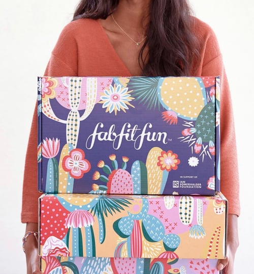
On a quarterly basis, FabFitFun ships out bold and colorful branded boxes to their subscribers — regularly updating their design with each shipment. We love their use of captivating prints that coordinates with the time of season. Not only is it visually appealing, it encourages subscribers to share their box on social media.
Once Upon a Bookclub Box
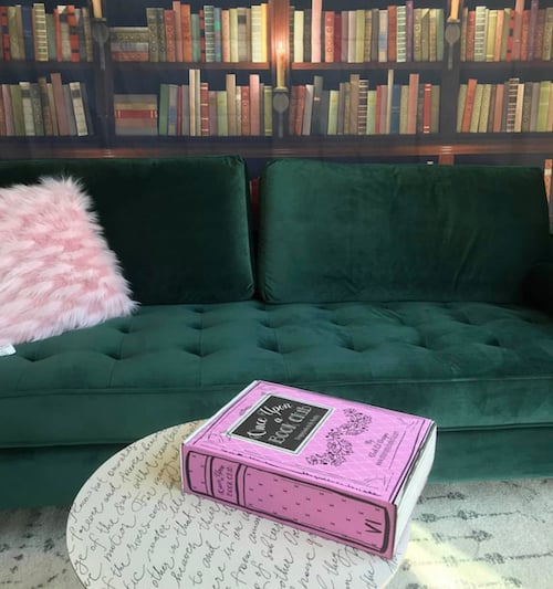
By mimicking the appearance of a book, Once Upon a Book Club's fun and clever packaging sets them apart from other book subscription services on the eCommerce marketplace.
Pusheen Box
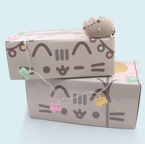
You can't deny it — this design is adorable. We like the way Pusheen Box uses the entire outer space of their box, rather than sticking to one or two panels, to provide a unique packaging experience.
Sprezza Box
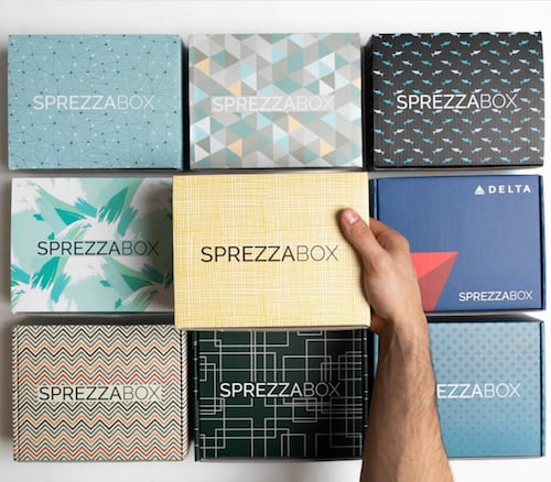
Featuring a different pattern every month, SprezzaBox differentiates its packaging design based on seasonality and the curated items within the box.
Festy Babe
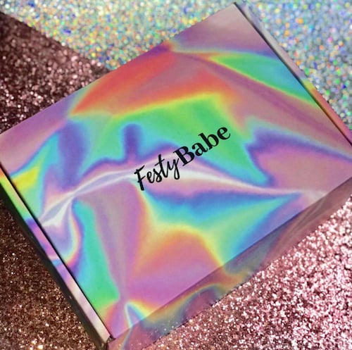
Using an eye-catching pattern on the outside of your box can provide a bold field to make your logo stand out. We love the groovy pattern that Festy Babe uses on their packaging.
Sense Box
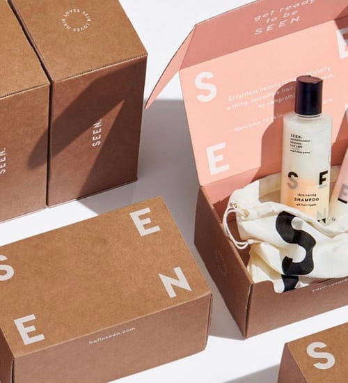
When it comes to packaging design, oftentimes less is more. This is why the minimalist design trend is becoming increasingly popular, especially with high-end luxury brands. We love the modern and simplistic look of SEEN's packaging.
Oat Box
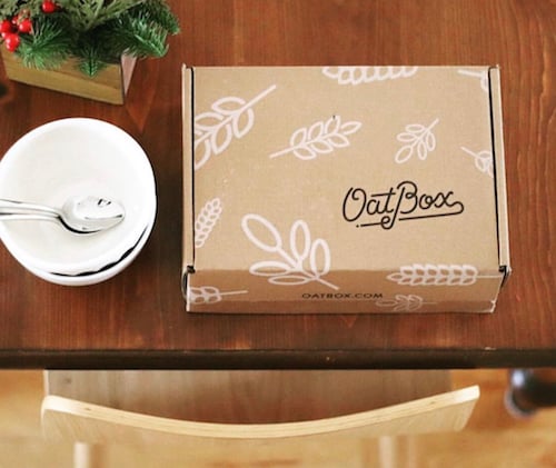
Using kraft material or kraft-colored packaging gives off a natural and earthy appearance — perfect for health-conscious food and beverage brands. Oat Box provides a great example of this trend done right.
Womb Box
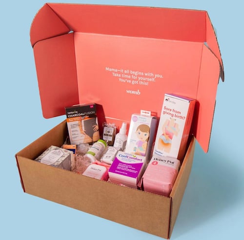
Inside print is a great way to add a unique touch during the crucial moment of unboxing. To contrast their simple outer packaging design, Womb Box uses bright colors and fun messaging inside the box to directly communicate with subscribers.
We Craft Box
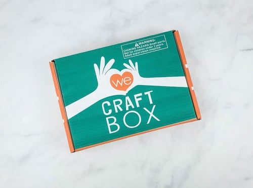
Colors play an important role in packaging. According to color theory, there's nothing that attracts the eye more than complementary colors. We enjoy the way We Craft Box uses complementary colors to make their logo standout.
Dead Bolt Mystery Society
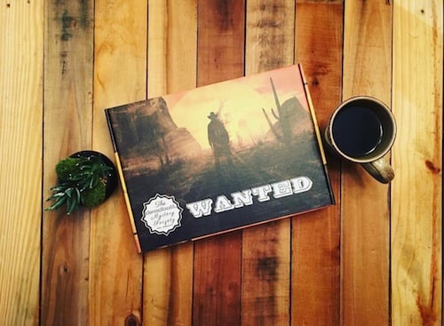
Each month, the Dead Bolt Mystery Society ships out a different packaging design based on the theme of the mystery inside. This creates an immersive experience for subscribers as they can begin to anticipate the contents inside based on the look and feel of their box.
Ready to Get Started?
At Fantastapack, custom packaging is our specialty. We have the power to provide a high-quality packaging experience that delights your subscribers every single month. With no order minimums, you can order as many as you want or as little as you need as your eCommerce business continues to grow.
Ready to launch your subscription box business or take it the next level? Start shopping now! If you're interested in learning more about creating your own subscription box, check out and download our ultimate guide to subscription box packaging.

